SAP Fiori Design Principles — The Five Ideas Behind Every SAP App
SAP Fiori was introduced in 2013. The five principles behind it have not changed since. That is not because SAP forgot to update them — it is because they got them right.
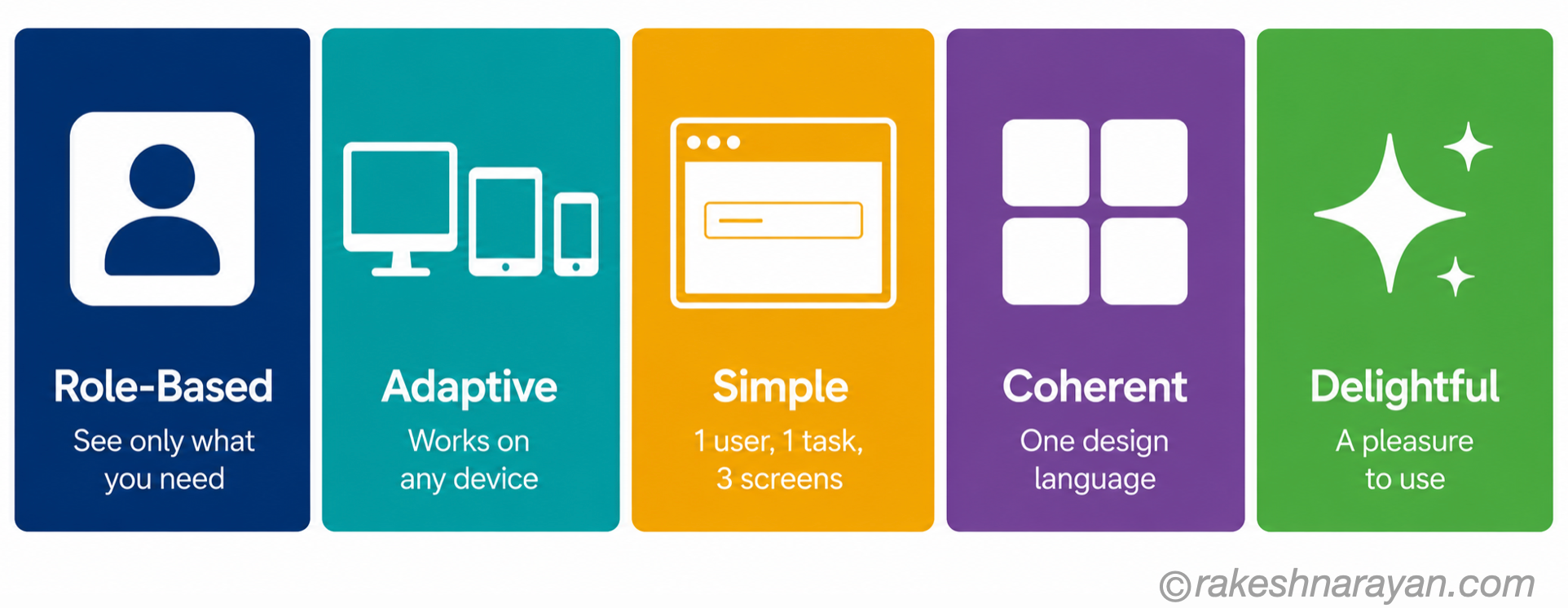
Role-based, adaptive, simple, coherent, delightful. These five words govern how every SAP Fiori application is designed and evaluated. Whether you are a developer building a custom Fiori app, a functional consultant configuring one, or an architect reviewing a UX design — these principles are the measure.
This post explains what each one means, where it comes from, and what it looks like in practice.
📌 Important update — June 2025
In June 2025, SAP expanded the Fiori design guidelines into the SAP Design System — a broader framework that covers all SAP digital products including AI-powered interfaces. The five Fiori principles remain at the core. If you see references to the ‘SAP Design System’ in newer documentation, it is the same foundation with a wider scope.
🔗 Useful context first
This post connects directly to SAP S/4HANA vs ECC — The Real Difference — Fiori as the default UX is one of the five key differences between S/4HANA and ECC. And to SAP BTP — The Platform Explained — SAP Build Apps on BTP uses Fiori design principles for all apps built on the platform.
Where SAP Fiori came from
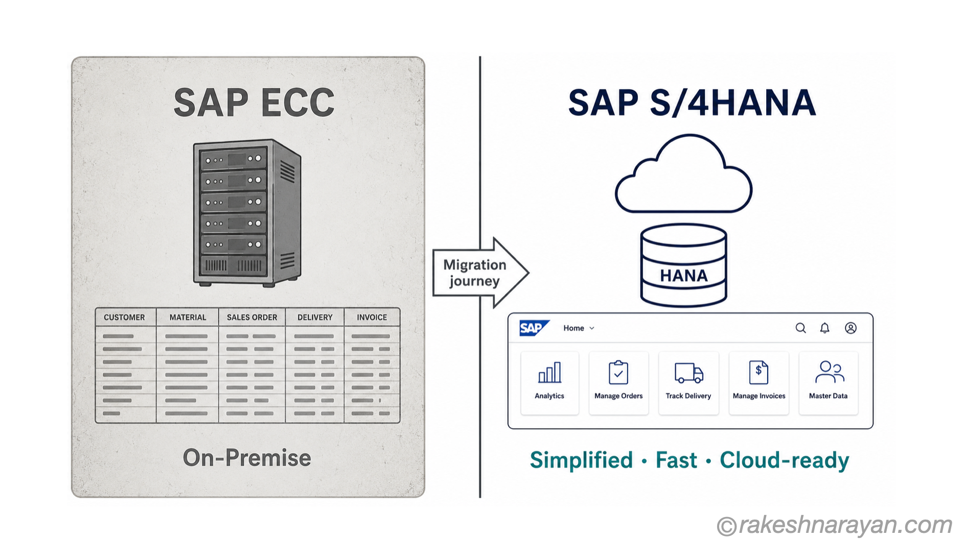
Before Fiori, SAP’s primary interface was SAP GUI — a desktop application with transaction codes, hundreds of input fields, and a learning curve that took months to navigate. It was built for power users doing repetitive high-volume tasks. It was never designed for occasional users, mobile devices, or modern expectations of software.
SAP Fiori was created to answer one question: what does an SAP user interface look like if you design it for the user rather than the system?
The answer was a set of simple, role-specific browser-based applications — each designed to do one thing well, on any device, consistently across the entire SAP landscape.
| SAP GUI | SAP Fiori |
|---|---|
| Transaction-code based — ME21N, FB60, VA01 | App-based — Purchase Order, Post Invoice, Sales Order |
| One interface for all users and all tasks | Role-specific apps — you see what you need |
| Desktop only — installed application | Browser-based — works on desktop, tablet, mobile |
| Hundreds of fields on one screen | Focused screens — one task, minimal fields |
| No consistent design across modules | One design language across all apps |
| SAP GUI still available in S/4HANA | Fiori is the default and strategic UX direction |
The five principles — in full
These are the official SAP Fiori design principles as defined in the SAP Design System. Each one has a reason for existing, and each one has a direct implication for how apps should be built.
| # | Principle | What it means | Design implication |
|---|---|---|---|
| 1 | Role-Based | Every Fiori app is designed for a specific role — a buyer, an approver, a warehouse worker. The user sees only what they need for their job. Nothing more. | Ask: who is this for and what do they need to accomplish? Strip everything else. |
| 2 | Adaptive | The same app works across desktop, tablet and mobile. The layout and interaction model adapts to the device — no separate mobile version needed. | Design for the smallest screen first. If it works on mobile, it will work on desktop. |
| 3 | Simple | Focus on one task, keep the screen uncluttered, reduce the number of steps. Fiori follows the 1-1-3 principle: one user, one use case, a maximum of three screens to complete a task. | If a field is not essential, remove it. If a step can be combined with another, combine it. |
| 4 | Coherent | All Fiori apps follow the same design patterns, visual language and interaction model. A user who learns one Fiori app can use another without relearning. | Use the standard Fiori floorplans and UI elements. Custom patterns break coherence. |
| 5 | Delightful | Beyond functional — the experience should be pleasant, responsive and reward the user. Speed matters. Smooth animations matter. Feedback on actions matters. | Micro-interactions, clear confirmations, meaningful loading states — small details add up. |
Each principle — a deeper look
1. Role-Based — the most important one
Role-based is the principle that changed SAP UX most fundamentally. SAP GUI assumed one interface for everyone — a finance user and a warehouse worker both looked at the same screens, just with different authorisations hiding some options.
Fiori reverses that. You design for a specific person in a specific role. A purchase order approver sees a list of pending approvals, the key information they need to decide, and an approve or reject button. Nothing else.
This is also why Fiori apps tend to have fewer fields. The question is not “what fields does the system support?” — it is “what does this person need to do their job?”
💡 Practical implication
When building or evaluating a Fiori app, the first question is always: who is this for? If the answer is vague (‘all users’ or ‘the finance team’), the app will be over-designed. Fiori works best when the persona is specific — accounts payable clerk, plant maintenance technician, sales manager.
2. Adaptive — not just responsive
SAP changed the terminology from ‘responsive’ to ‘adaptive’ deliberately. Responsive design means the layout adjusts to screen size. Adaptive goes further — the interaction model, the information density and the navigation pattern all adapt to the device.
A Fiori app on mobile does not just shrink the desktop layout. It may show fewer columns in a table, use swipe gestures instead of buttons, or collapse navigation differently. The intent is the same — but the execution fits the device.
3. Simple — the hardest principle to maintain
Simple sounds obvious. In practice it is the hardest to maintain — especially in SAP projects where stakeholders consistently ask for more fields, more filters and more columns.
The 1-1-3 principle is SAP’s concrete definition of simple: one user, one use case, and no more than three screens to complete a task. This is a design constraint, not just a guideline.
The pressure to add more is constant. A field that is ‘nice to have’ on the screen adds visual noise for every user every time they open the app — not just the occasional person who needs it. Simplicity requires active discipline.
4. Coherent — consistency across the landscape
Coherent means that a user moving between a Procurement app, an HR app and a Finance app experiences the same patterns, the same navigation model and the same visual language across all of them.
SAP enforces this through SAPUI5 controls, Fiori floorplans (List Report, Object Page, Overview Page) and the Fiori design guidelines. Apps built to these standards feel like one system — not a patchwork of different tools.
Where coherence breaks down is usually in heavily customised or third-party apps that ignore the standard patterns. Users notice — even if they cannot articulate why — and adoption suffers.
5. Delightful — not a luxury
Delightful is the principle that people sometimes dismiss as soft or optional. It is not.
Delight in enterprise software means: the app responds quickly, feedback on actions is immediate and clear, loading states are meaningful, error messages are helpful rather than cryptic, and the interaction feels smooth. It does not mean animations for their own sake.
The business case for delight is user adoption. Users who find an app unpleasant to use find workarounds — shadow spreadsheets, paper processes, workarounds. Delight is how you close that gap.
Fiori app types — what the principles produce
The five principles gave rise to three standard Fiori app types, each suited to a different use case:
| App type | Purpose | Example |
|---|---|---|
| Transactional apps | Create, change or display a single business object | Create Purchase Order, Post Invoice, Approve Leave Request |
| Analytical apps | Monitor KPIs, trends and operational data — read-only | Sales Dashboard, Stock Overview, Outstanding Receivables |
| Fact sheets | Display key information and relationships for an object — quick overview | Customer 360, Material Overview, Supplier Info |
💡 SAP Fiori Elements
Most standard SAP Fiori apps are built using SAP Fiori Elements — a framework that generates the UI automatically from OData annotations and metadata. Developers define the data model and annotations; Fiori Elements renders the standard floorplan. This enforces coherence by design and dramatically reduces development time. Custom-built apps use SAPUI5 directly and must apply the principles manually.
Fiori in 2025-26 — what has changed
| What has changed | What it means |
|---|---|
| SAP Design System (June 2025) | Fiori guidelines now cover all SAP digital products — web, mobile and AI interfaces. The five principles remain the core. |
| AI-embedded apps | Joule and AI copilot features are now part of Fiori apps — the adaptive and coherent principles extend to AI interaction patterns |
| SAP Build Apps | Low-code app building on BTP uses Fiori design as the standard — the principles apply to apps built by non-developers too |
| Horizon visual theme | The current Fiori visual theme — cleaner, more contemporary, higher contrast for accessibility |
| Fiori for iOS and Android | SAP Fiori mobile apps follow both Fiori principles and native platform (Apple/Android) guidelines simultaneously |
The five principles at a glance
| Principle | One-line definition | The question it answers |
|---|---|---|
| Role-Based | Design for one specific person and their job | Who is this app for and what do they need? |
| Adaptive | Works on any device — layout and interaction adapt | How does this work on a phone? |
| Simple | One task, minimal screens, no unnecessary complexity | What can we remove without losing function? |
| Coherent | Consistent design language across all SAP applications | Does this feel like the same system as the other apps? |
| Delightful | Fast, responsive, pleasant — goes beyond just functional | Would a user choose to use this if they had a choice? |
What to take away
The five Fiori principles are deceptively simple to state and surprisingly hard to consistently apply — especially in real SAP projects under delivery pressure. Every request to add one more field, every decision to skip proper role analysis, every shortcut on responsiveness chips away at them.
But when they are followed, the result is visible. User adoption goes up. Training time goes down. Support tickets related to usability reduce. These are not coincidences — they are what good UX principles produce when consistently applied.
If you are building on SAP today, these five principles are not optional guidance. They are the design language of the platform.
🔗 Related posts on this site
SAP S/4HANA vs ECC — The Real Difference — Fiori as the default UX is one of the five key changes from ECC.
SAP BTP — The Platform Explained — SAP Build Apps on BTP uses Fiori design principles for all custom apps.
What is SAP? — the broader SAP product context that Fiori sits within.
Published on rakeshnarayan.com — Articles
URL: https://rakeshnarayan.com/articles/sap-fiori-design-principles/